When urbanists evaluate neighborhood transformation over a two-decade span, demographic shifts are frequently analyzed as standard metropolitan churn.
On paper, mapping 2000–2020 census data across historic neighborhoods in Brooklyn and Manhattan reveals deep, systemic patterns of population restructuring.
HOWEVER!
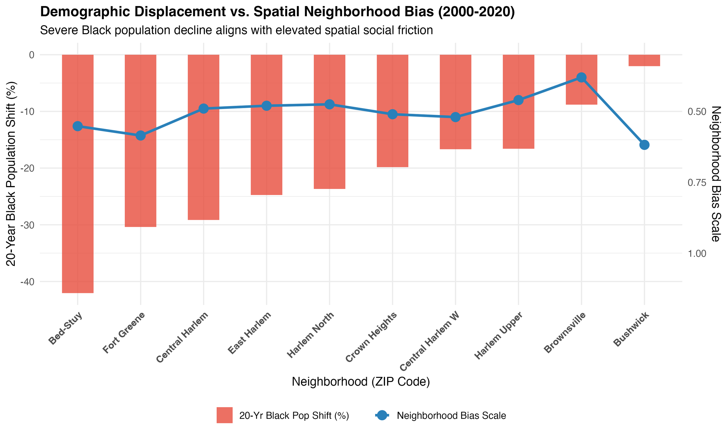
Look at how severe demographic displacement aligns with the Neighborhood Bias Scale. The corridors experiencing the steepest 20-year Black population declines—such as Bed-Stuy (-42.0%) and Fort Greene (-30.4%)—anchor the extreme end of the distribution alongside distinct spatial friction.
Meanwhile, lower-displacement corridors like Brownsville (-8.8%) and Bushwick experience vastly different trajectories, highlighting the uneven geography of displacement and structural bias across the borough.
DEMOGRAPHIC DISPLACEMENT VS. SPATIAL NEIGHBORHOOD BIAS
R / ggplot2 • Census Data • Spatial Econometrics